

Shree Partners
Brand development
Shree Partners is a digital transformation and technology solutions company, delivering IT infrastructure, business intelligence and data management to companies primarily in the travel, healthcare, finance and insurance sectors.
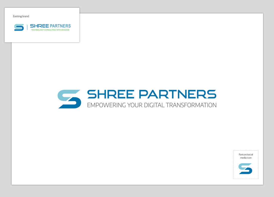
Shree had an existing logo and website but lacked a cohesive brand identity. I reviewed and revised the branding, updating the logo and creating a consistent, dynamic identity across all communications.
The original logo included mixed elements and typefaces and was designed for digital use without proper colour references. Rather than replacing it, I refreshed the logo by colour-matching for both print and digital use, ensuring consistent typography, and adding a literal ‘cutting edge’ diagonal line through the ‘S’.
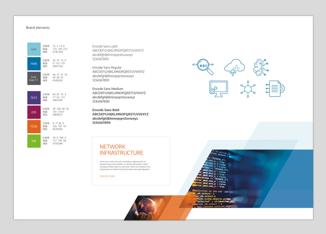
I complemented the logo colours with a bright, flexible colour palette inspired by the company’s location in India. These colours add a vibrancy and warmth that is often lacking in tech branding. A modern, sans serif, OpenType font was selected to work across both digital and print formats. The dynamic ‘edge’ theme continues across the branding with diagonally slanted images and graphics.
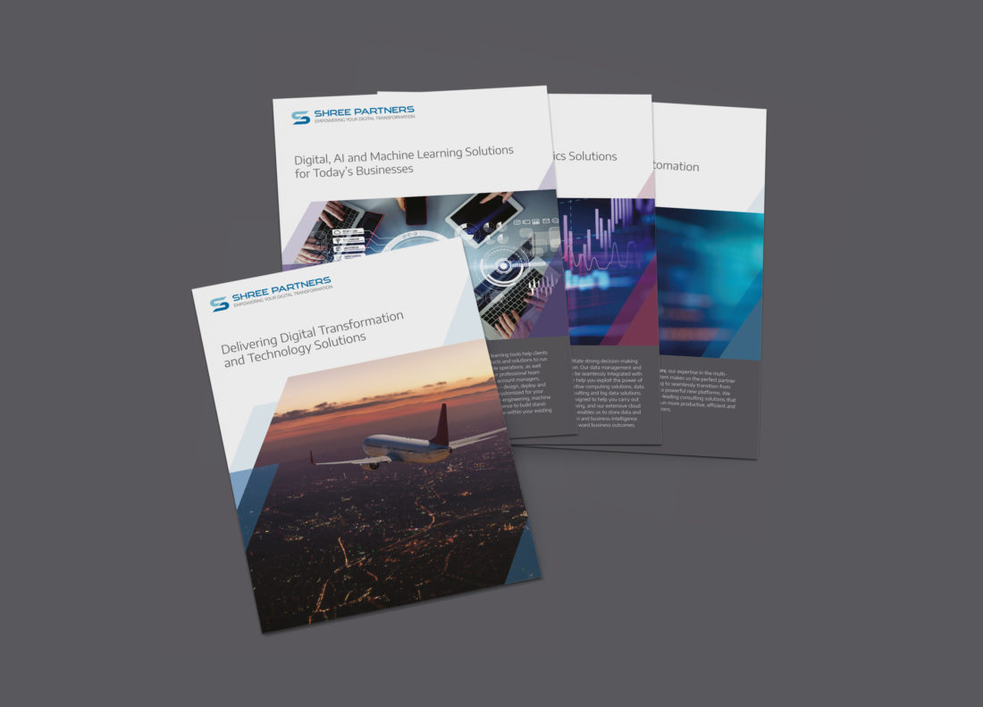
The new brand features across a range of materials, including brochures, sales tools, event support and website.
Client
Shree Partners
Category
Branding, Digital, Print