
Aimendo
Brand creation and development
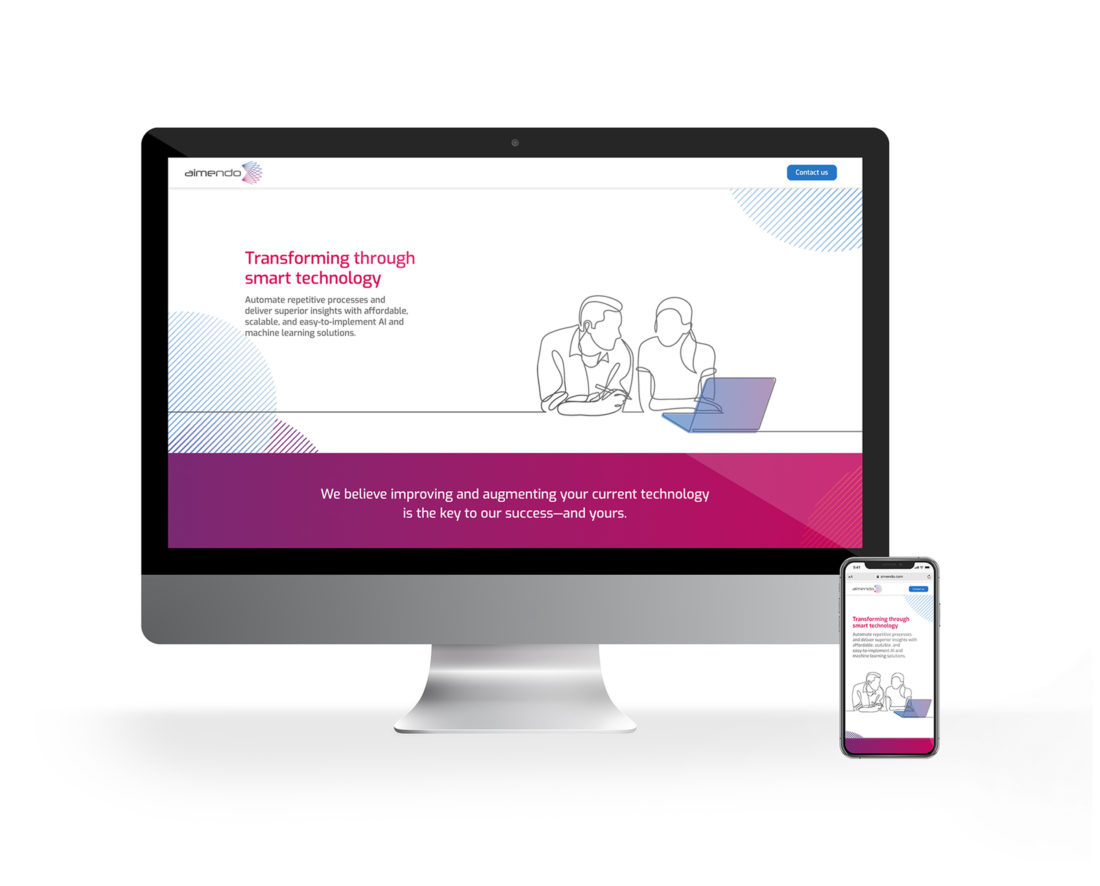
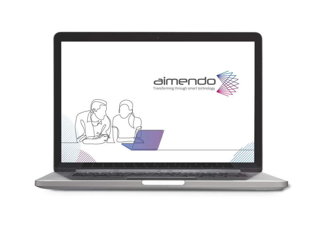
Aimendo is a US-based technology company delivering AI solutions to the travel sector. As they had recently formed, they had no brand material. I created a full brand identity, including website landing page, presentation pitch deck and sales collateral.
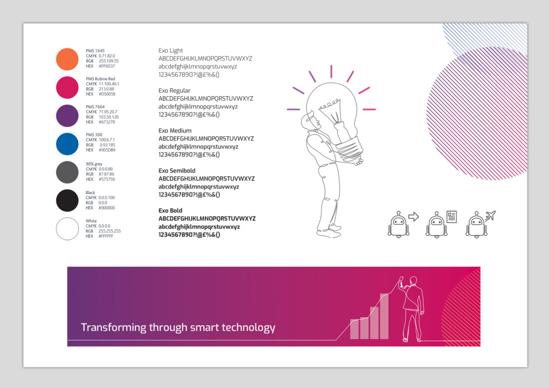
I wanted to present Aimendo as an exciting and dynamic company at the forefront of leading technology. The logo takes inspiration from data diagrams and neural networks and fans out to suggest reach and forward movement. This is also reflected in the use of continuous line illustrations and hatched line graphics in the accompanying brand. The colour palette is bright and bold, away from the austere blacks and greys often used in tech branding. The supporting typeface, Exo, is a sleek, sans-serif that aligns with the sector.
Client
Aimendo
Category
Branding, Digital, Marketing