Colour psychology
Choosing colours for your brand? One aspect to consider is the area of colour psychology.
It’s often stated that certain colours elicit certain emotions – red excites, while blue calms. But there is a lack of scientific proof to really qualify those claims. Many of our opinions on colour come down to personal preference or cultural associations.
However, we shouldn’t be too quick to dismiss. According to the research paper Impact of color on marketing, the colours you choose do matter. “People make up their minds within 90 seconds of their initial interactions with either people or products. About 62-90 percent of the assessment is based on colors alone.” (Satyendra Singh, ‘Management Decision’, 2006)
So where to start if you’re launching a new brand or product? Some industry sectors have clear associations with certain colours, whether intentionally or not, and that will feed into the cultural and symbolic associations we form. For example, brands within entertainment or fast food often use red; banking and technology companies frequently use blue; high-end fashion maintains its cool with black; and green becomes an obvious choice for those in health or sustainability.
It’s important for a new brand to differentiate itself, so there is an argument to use a different colour from the crowd of competitors. However, the general consensus is a colour needs to ‘fit’ the product’s positioning – so if your brand is youthful and fun, brown is perhaps not the best colour for it.
Facts about colour
Red
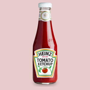
Commonly used by entertainment, food and fast food restaurant brands. Red is a stimulating colour. But did you know that women see more shades of red than men? It’s all down to a gene found in the x-chromosome (link).
Orange
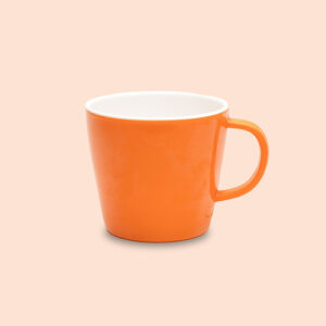
Orange is considered to be youthful and fun, so it is also used in the arts, entertainment and food sectors. Next time you have a hot chocolate make sure it’s in an orange cup. Apparently, it tastes better (link).

Yellow
Yellow is the colour our eyes process first. It’s attention grabbing so no wonder it’s used in the construction and transportation industries. Overall, it’s interpreted as a cheerful colour. But it’s not very accessible and large areas of yellow can cause eye strain (link)

Green
Associated with nature, green is the obvious choice for health, food, environmental and energy sectors. Perhaps it’s that last sector that makes us a little suspicious about claims of sustainability. Studies show that using green can backfire if seen to ‘green-wash’ (link)

Blue
Often cited as the world’s favourite colour (link), blue represents stability, reliability and trustworthiness. Sectors that frequently use blue in their branding are finance, law, manufacturing and technology.
Purple
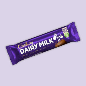
From the days of extracting expensive purple dye from sea snails, purple has become synonymous with wealth and luxury. High-end retail, chocolate manufacturers and also estate agents have promoted the idea of luxury by using purple.
Pink
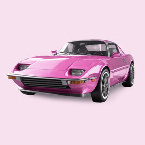
It wasn’t until the 1920s that pink became associated with girls (link). Other than a symbol of femininity and romance, pink can also signify youth, innovation and defiance. Sectors that use pink include fashion, breast cancer charities, sweet food brands and several apps.

Brown
If blue is cited as the world’s favourite colour, then brown is almost universally cited as the least. Brown is an earthy, reassuring colour, and a softer choice of a neutral than black. Plus, it’s an obvious choice for chocolate, coffee and beer.


